Case study /04 — Brand & portfolio · self-initiated · 2026
The site you're reading is the case study.
samiahmedansari.com v1 was a clean, solid build — on a design that wasn't mine. v2 is the argument itself: if I can make type, motion, and performance work this hard for my own brand, I can do it for yours.
01 — Where v1 stood
Credit where due: v1 was a proper build. A publicly available Figma design, converted by hand into WordPress — clean enough to score 95 accessibility and perfect Best Practices and SEO marks on Lighthouse. It worked. It just didn't work for me.
The design was one anyone could download. The typeface, the palette, the layout — all inherited, not chosen. Nothing moved. Mobile LCP sat at 4 seconds. In an era where every freelancer has a decent-looking site, decent-looking is invisible: the site drove almost no visitors and gave the ones who arrived nothing to remember.
The diagnosis wasn't “bad design.” It was zero proof. A developer's portfolio has one conversion job: make a visitor think “if he can build this, he can build mine.” A design I didn't make can't say that about me — no matter how well I converted it.
01b — Exhibit A: the whole of v1
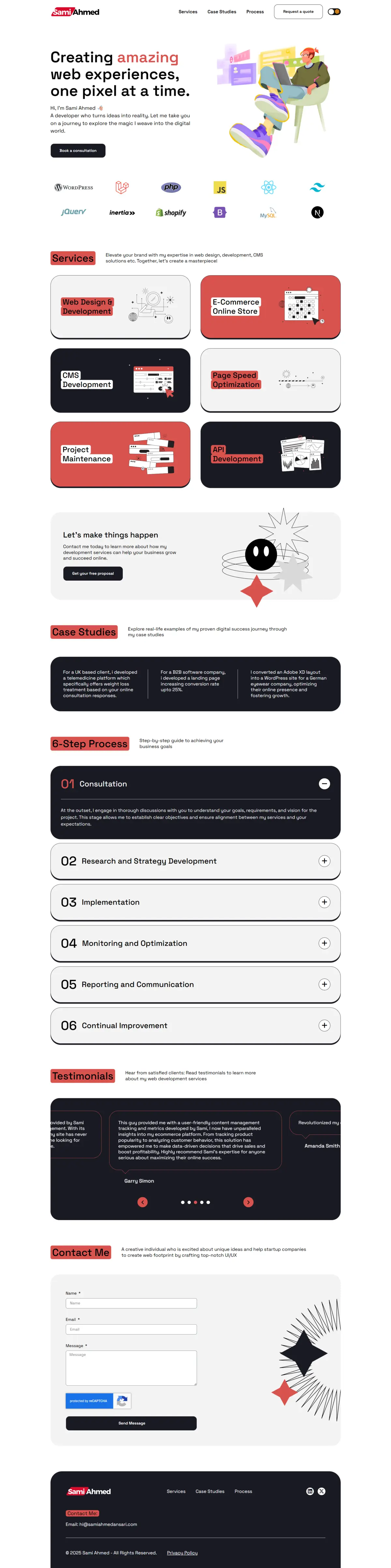
The before, preserved in full. For the after — you're already scrolling it.
02 — The idea
v2 had four goals: a design that's unmistakably mine, speed that's felt before it's measured, motion that makes the site feel alive, and a brand that survives outside the browser. One concept carries all four: EVERYTHING IS TYPE. A developer's raw material is characters, so the whole brand is built from them — the 3D hero renders as ASCII, the preloader is a terminal, sections are numbered like spec clauses, the footer is a git log, and the logo ends in a blinking caret: still typing, still learning. The old brand's red survives, sharpened from #D90A2C to Signal #FF3B1F and rationed like a scarce resource — when everything shouts, nothing converts.
03 — What changed
| v1 — template | v2 — proof of work | |
|---|---|---|
| Platform | WordPress + Elementor page builder | Next.js 15 · TypeScript · hand-coded |
| Design | Publicly available Figma design (soft SaaS style), converted faithfully — but not mine | “Everything is type” — a brutalist system designed from scratch; even the 3D renders as ASCII |
| Color | Muted red #D90A2C on white — inherited with the design | Signal #FF3B1F on bone #F2EFE9 / ink #111110 — red rationed to ≤5% per view |
| Typography | Space Grotesk — came with the design | Archivo (100–900 variable) + JetBrains Mono annotations, self-hosted |
| Logo | Name in a skewed red banner | Wordmark + blinking terminal caret; SA▌ block monogram for favicon |
| Content | Said everything, emphasized nothing — six services, long process copy, content without hierarchy | Ruthlessly edited: three offers, four process steps, one action — every element earns its place |
| Services | 6 overlapping offerings | 3 outcome offers: LAUNCH · SELL · ACCELERATE |
| Motion | None — a fully static layout | 7 sections, 7 type-based signatures: proximity weight, strike-through, roll-to-outline, scramble decode, line-draw, drag rail, typewriter |
| Speed | 79 mobile performance · LCP 4.0 s (desktop: 100) | Budget: LCP < 1.2 s · 161 KB first-load JS · Three.js lazy-loaded — measured at deploy |
| Accessibility | Considered from the start — 95/100 | Extending that 95: reduced-motion tier for every effect, keyboard focus styles, semantic HTML |
04 — Measured results
161 KB
first-load JS — under the 170 KB budget, Three.js lazy-loads after
100%
statically pre-rendered — every route ships as plain HTML
7/7
sections with a bespoke, type-based interaction signature
0
borrowed design decisions — brand, type system, and every interaction are mine
Lighthouse scores publish here after production deploy — measured, not promised.
05 — Stack
Next.js 15 · React 19 · TypeScript strict · Tailwind CSS v4 · GSAP + ScrollTrigger · Three.js (react-three-fiber) · Lenis · self-hosted variable fonts · Vercel